Introduction
Regardless of the type or topic of the research, researchers collect data, summarize them and present as study findings. Summarization type inferences our decisions on statistical testing (1). Proper way of presenting data ensures easier communication with scientific public. This feature of statistics is called descriptive statistics and purpose of this article is to clearly present and explain correct usage of descriptive statistics for numerical data.
Scientific hypothesis and type of the study define variables that have to be measured, producing data. Data types with corresponding scales of measurement determine summarizing and presentation rules. Measurement is a procedure whereby numerical values or labels are assigned to individual subjects according to an unambiguous rule. Assignment rules are determined by four distinct scales of measurement: nominal, ordinal, interval and ratio (2).
Scales of measurement
Nominal scale defines mutually exclusive categories with no relations and no order between them, e.g. gender (males, females), blood groups (ABO system: A, B, AB, and 0 groups), and human race (Caucasian, Asian, African-American, other). Ordinal scale defines ordered categories, e.g. disease stage (mild, moderate, and severe) or student exam grade (insufficient to excellent, in five categories), all of them with unknown interval sizes between categories. For example, severe disease is preceded by moderate and moderate by mild, but “distances” between them cannot be calculated. Therefore, nominal and ordinal measuring scales are denoted as categorical or qualitative scales, assigning quality to measured property.
When intervals between categories are known and equal, scales of measurement are numerical or quantitative, and this paper is about them. Interval scale assigns variables with no natural zero value, e.g. temperature in °C and pH of solution, where zero value is agreed (for example, 0 °C is temperature agreed as freezing point of water, not referring that there is no temperature when 0 °C is measured). Ratio scale is a numeric scale with the existence of absolute zero, e.g. temperature in K and concentration in mol/L. There is no real existence of property measured with ratio scale if value is 0, i.e. there is no temperature when 0 K is measured (sometimes also denoted as “absolute temperature”) or there is no substance in solution with 0 mol/L concentration.
Scales of measurement correspond to data scales. Hence, nominal data have arbitrary labels of categories and no ordering, while ordinal data have ordered categories that are insignificant and unequal in size. Interval data are ordered according to a constant scale, have no natural zero and therefore only difference between two values makes sense. Ratio data are ordered according to a constant scale, have natural zero and therefore, ratio of two values makes sense and might be interpreted (e.g. sedimentation rate of 10 mm/h is 2 times smaller than 20 mm/h, but temperature of 20 °C is not 2 times higher than 10 °C). While categorical data might be presented by description of categories or numbers assigned to them, numerical data are always presented by numbers (3).
Numerical data
Original (raw) data collected during the research are usually not presented in scientific papers, with the exception of the cases when only few measurements occur (e.g. case presentation, small sample study). With more subjects included in the research, numerical data must be summarized by descriptive statistics. Three major sample characteristics have to be presented for each variable: distribution, central tendency (average), and dispersion (spread).
Distribution
Distribution summarizes the frequency of individual values or value ranges for a variable (4). Empirical distribution denotes data distribution from the research sample, while theoretical distribution presents mathematical function. Most common theoretical distribution used in biomedicine is normal or Gaussian distribution. It is symmetric, bell shaped, continuous distribution opened on both sides to infinity. If empirical distribution fits to normal, it is said that data are distributed normally; otherwise, data are not normally distributed.
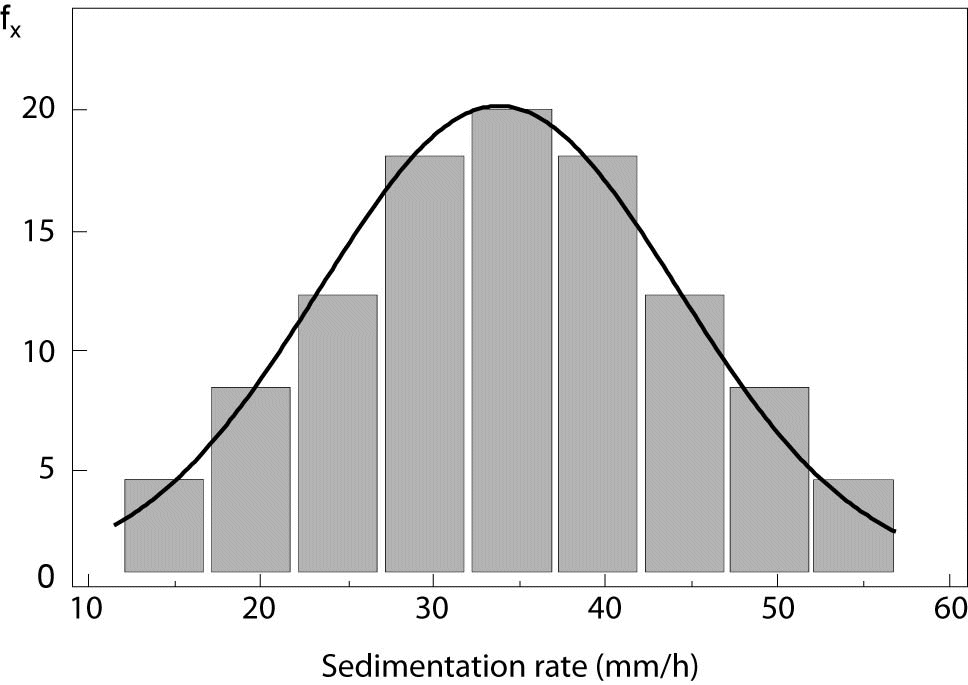
Empirical distribution is graphically displayed by histogram. It consists of vertical rectangles aligned on x-axis, where width of rectangles relates to value ranges for a variable and height is proportional to frequency of values presented. Figure 1 displays empirical distribution of sedimentation rate and theoretical normal distribution, which is presented by normal distribution curve. In the example, it is clearly visible that empirical distribution fits to normal. Kolmogorov-Smirnov and D’Agostino-Pearson tests are usually used in statistics to test normality of empirical data (5).
Figure 1. Normal distribution (X – X-axis, fx – frequency, SD – standard deviation).
Central tendency
Central tendency is an average value, an estimate of the midpoint (center) of all measured values (4). Mostly used central tendency estimates in biomedicine are arithmetic mean, median and mode.
Arithmetic mean, sometimes referred as “mean” only, is value calculated by summing up all the data from the sample and dividing the sum by number of values (i.e. average of data set “2, 2, 5, 7, 8” is 24/5 = 4.8). Among introduced, it is the only algebraically defined measure of central tendency. Numeric data are presented by arithmetic mean only if data fit to normal distribution. Otherwise, median or mode estimates should be used; and this is also the case with small samples, regardless normality.
Median is the middle value in a list of data sorted either from lowest to greatest value or vice versa (e.g., in a set of data “2, 2, 5, 7, 8”, median value is 5). Mode represents the most frequent value in a set of data (e.g., mode from the set “2, 2, 5, 7, 8” is 2). Empirical distribution might be unimodal, having one mode value (aforementioned example), bimodal (e.g., data set “1, 2, 2, 3, 4, 4, 5” is presented with two modal values, 2 and 4) and multimodal. Both median and mode might be used as central tendency estimates in unimodal distributions, but only mode estimate can be used for bimodal and multimodal distributions (4).
Dispersion
Dispersion refers to estimates of the spread of data around central value. Two common measures are used in biomedicine: standard deviation and range (3).
Standard deviation (SD) is determining the extent to which each observation deviates from arithmetic mean, therefore, it is used only with normally distributed data. Standard deviation is square root of a variance, and variance is calculated as the average squared deviation of each number from its mean. Arithmetic mean and standard deviation of numerical data set are usually noted with mean ± SD. The larger the standard deviation, the greater the variability of observations in sample is.
Range is an estimate of spread in data not following normal distribution. It is presented by two numerical values and, depending on their origin, three types of range presentation may be distinguished:
- Range as minimum and maximum, sometimes referred to as full data range, uses lowest and highest values of the set to determine dispersion.
- Range as 1st and 3rd quartile, commonly referred to as interquartile range. If ordered numerical set is divided in four equal parts, three breakpoints between the lowest and the highest value present quartiles: 1st, 2nd, and 3rd. Obviously, each quartile contains one quarter of data. Median value is equal to the 2nd quartile. Interquartile range contains half of measurements.
- Range as lower and upper percentile, sometimes referred to as percentile range. If ordered numerical set is divided in hundred equal parts, 99 breakpoints between lowest and highest value present centiles or percentiles: 1st, 2nd, 3rd, etc. up to 99th percentile (assigned also as 1%, 2%, 3%, ... 99%). In biomedicine, mostly used percentile ranges are 5–95% and 10–90%. Median value is equal to 50th percentile.
Median and range of a numerical data set are usually indicated as median (lower range value – upper range value), but range type has to be introduced before referring to values (e.g., in Methods section of the paper author states that numerical data are presented with median and interquartile range).
Authors sometimes calculate the difference between the highest and the lowest range value and report it as one estimate of the spread, most commonly for interquartile range (4). For example, instead reporting values of 34 (30–39) for median and interquartile range, one can report 34 (9). However, calculated range is less informative than interval values and therefore not recommended.
Graphical data presentation
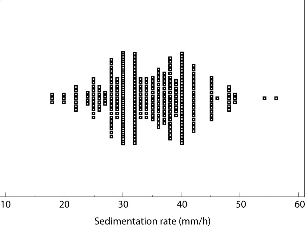
To achieve better understanding of observed numerical data, graphical presentations might be used. The simplest version is scatter plot, presenting raw data from research with no summarizing values. Figure 2 is an example of scatter plot, displaying value of sedimentation rate (mm/h) for each individual in the group, demonstrated by a small square. Allocation and density of the squares are useful for graphical determination of measures of central tendency and dispersion. Apart from the scatter plot, two commonly used graph types in descriptive statistics are error bar plot and box-and-whisker plot (4,6).
Figure 2. Scatter plot.
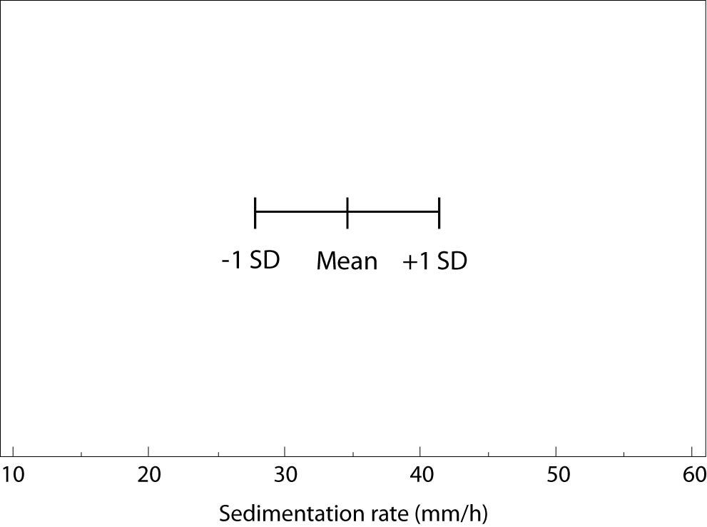
Generally, error bar plot consists of the line crossed with three marks. Middle mark represents central tendency estimate and the other two represent the upper and the lower values of the spread. Figure 3 is an error bar plot presenting mean (34 mm/h) and standard deviation (6 mm/h) of the sedimentation rate measured for a group of 312 subjects. Although all types of numerical data may be presented by an error bar plot, displaying mean and standard deviation for normally distributed data is most common, intuitive, and therefore recommended.
Figure 3. Error bar plot (SD – standard deviation).
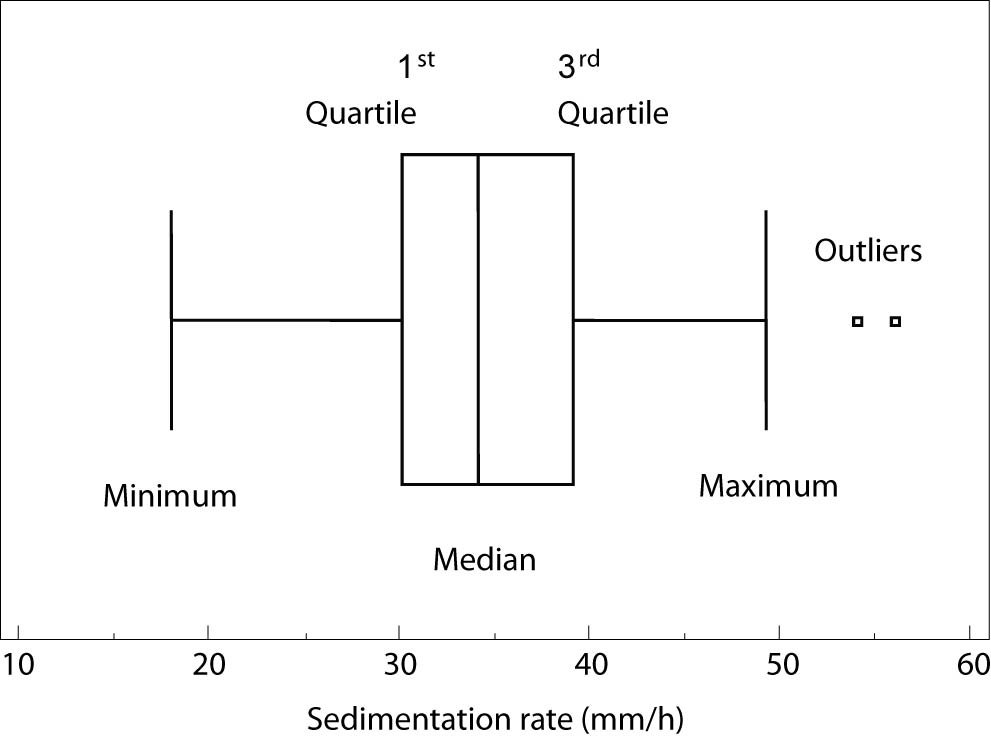
Box-and-whisker plot was originally designed to present data not following normal distribution (7). It consists of rectangular (box) representing values of the 1st and the 3rd quartile, separation line inside box representing median value, and two lines extending from the box (whiskers) representing minimum and maximum values. Other descriptive parameters assigned to the parts of box-and-whiskers plot might be found. For example, the software Statistica allows the user to choose between median and mean to measure the central tendency, and 1st/3rd quartile and standard deviation to measure the dispersion (8), but these choices might confuse the reader and are, therefore, not recommended.
Figure 4. Box-and-whiskers plot.
Figure 4 presents box-and-whisker plot of sedimentation rate for 312 subjects with median (34 mm/h), 1st quartile (30 mm/h) 3rd quartile (39 mm/h), minimum (18 mm/h) and maximum values(49 mm/h), and two outliers (54 and 55 mm/h). As clearly presented with this example, minimum and maximum in box-and-whisker plot do not have to be the lowest and the highest values of measured data due to the possible existence of outliers, i.e., values that are numerically distant from the rest of the data from the sample (9). Outliers in descriptive statistics can be recognized only by calculation: an outlier is each value smaller than the 1st quartile decreased by interquartile range multiplied by 1.5, or each value greater than the 3rd quartile enlarged for interquartile range multiplied by 1.5. Even greater abnormalities in distribution of numerical data are sometimes recognized as far out values of far away outliers, where interquartile range from the calculation above is multiplied by 3 (10). Outliers might be excluded from further data analysis, but it is not allowed to hide or delete them, because they can indicate the effects of the unknown features in research (confounding factors).
Error bar and box-and-whisker plots can be oriented horizontally or vertically and they are a good choice when we want to show the comparison of several variables.
In conclusion to numerical data summarization, if data distribution follows normal distribution, arithmetic mean should be used as measure for the central tendency and standard deviation as a measure for the spread. On the other hand, i.e. if distribution is unknown, skewed or distorted, or with small samples, median with range should be used to summarize data. Bimodal and multimodal distributions require further analysis of data characteristics that are beyond this article. Presentation of numerical data is suggested using one of two most common graphs: box-and-whisker plot for not normally distributed data and error bar plot in cases when the distribution of the data is normal.
Acknowledgement
The authors thank to Mrs Nina Ivanović for a language editing of a manuscript.


